At Not You Again, we are not approaching lightandshadowgame.com as a standard article website, blog, news feed, or entertainment-magazine layout.
This is not a Comedy Central-style editorial page with headline cards, celebrity-news hierarchy, generic thumbnails, and “latest posts” stacked like disposable content. That structure may work for current events, commentary, satire, or entertainment publishing, but it is the wrong language for Light & Shadow.
Light & Shadow is not a news brand. It is a strategic world.
It teaches Go / Baduk through atmosphere, visual identity, tension, philosophy, and interactive progression. The website must therefore behave less like a feed and more like a cinematic game interface, a tactical training archive, and a mythic strategy environment.
1. The Core Problem
The danger with this project is that WordPress naturally wants to turn everything into a blog.
Posts become cards.
Cards become grids.
Grids become news blocks.
News blocks become generic.
Generic becomes forgettable.
That is exactly what we are avoiding.
A typical news layout says:
“Here are some articles. Click one.”
But Light & Shadow should say:
“Enter the board. Choose your discipline. Study the shape. Make your move.”
That difference is the entire restyling strategy.
2. Project Identity
Website
lightandshadowgame.com
World Title
City of Go
Alternative Title
How to Play Go / Baduk
Creative Direction
A cinematic, ink-on-paper strategy universe where the ancient logic of Go is translated into visual myth, tactical training, and atmospheric storytelling.
The site combines:
- Japanese / East Asian ink painting atmosphere
- 3D-generated cinematic environments
- Go-board architecture
- handwritten instructional fragments
- multilingual learning quotes
- black stone / white stone duality
- strategy archetypes
- iOS-first interface design
- full-screen rotating background worlds
The website is not just there to explain Go.
It is there to make Go feel like a place.

3. Studio Position
This project sits directly inside the Not You Again creative method:
Take something that could become generic, then rebuild it as a branded universe.
For Light & Shadow, that means:
Not a blog.
Not a news portal.
Not a course directory.
Not a chess-club website.
Not a Wikipedia-style explanation of Go.
Instead:
A strategy interface.
A visual game manual.
A mythic learning environment.
A City of Go.
The user should not feel like they are scrolling through articles.
The user should feel like they are moving through a board.


4. Why the News-Article Format Is Wrong
A news-style article website creates the wrong emotional structure.
It gives equal visual weight to everything.
It makes content feel temporary.
It rewards headlines over atmosphere.
It treats images as thumbnails instead of worlds.
It makes lessons look like articles.
It turns strategy into content consumption.
That does not match Go.
Go is not loud.
Go is not reactive.
Go is not headline-driven.
Go is not “breaking news.”
Go is slow pressure.
Quiet threat.
Territory.
Patience.
Shape.
Memory.
Consequences.
So the website must be structured around strategic progression, not publication order.
5. New Direction: Website as Game World
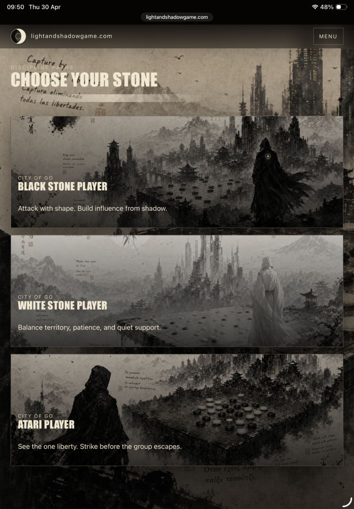
The restyling reframes the website around three generated background worlds:
1. Black Stone Player
The aggressive path.
Shadow, influence, attack, pressure, invasion.
This visual should feel darker, heavier, and more dominant. It represents strategic force and territory-building from threat.
Copy direction:
Attack with shape. Build influence from shadow.
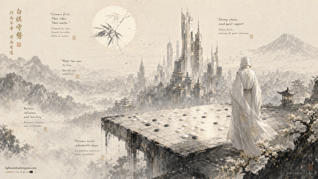
2. White Stone Player
The patient path.
Balance, defense, support, timing, quiet strength.
This visual should feel lighter, more spacious, calmer, and more controlled. It represents patience, connection, life, and influence through restraint.
Copy direction:
Balance territory, patience, and quiet support.
3. Atari Player
The tactical path.
Immediate danger, one liberty, capture, urgency, reading.
This visual should feel tense, precise, and sharper. It is the tactical training world: the moment where a group has one liberty left and the player must see the vital move.
Copy direction:
See the one liberty. Strike before the group escapes.
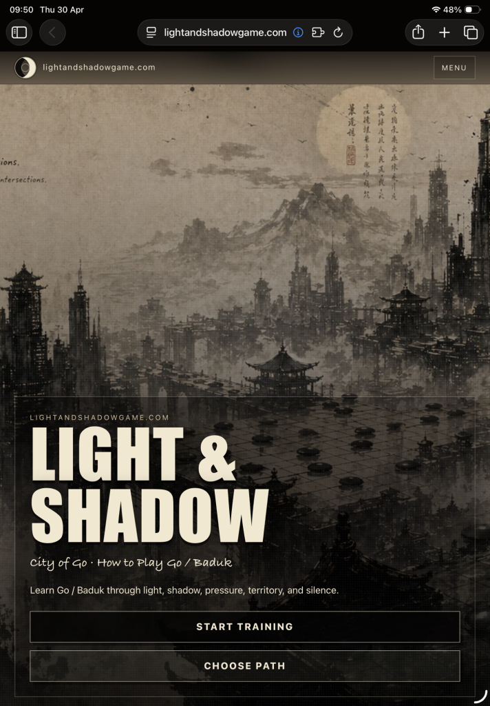
6. Homepage Strategy
The homepage should not open like a magazine.
It should open like a title screen.
Hero Section
The first viewport should be cinematic and simple:
LIGHT & SHADOW
City of Go · How to Play Go / Baduk
Supporting line:
Learn Go / Baduk through light, shadow, pressure, territory, and silence.
Primary actions:
Start Training
Choose Path
The background rotates slowly between the three worlds, making the site feel alive without becoming distracting.
This is not decoration.
The background is the brand.
7. The Three Path Cards
The three generated worlds must appear as three clear options, preferably in three columns on desktop and stacked on mobile.
They are not random article cards.
They are entry points.
The user chooses a role:
Black Stone Player
White Stone Player
Atari Player
This gives the site a game-like structure.
Instead of:
“Read our latest posts.”
We create:
“Choose your discipline.”
That single change removes the generic news-site feeling and turns the page into a strategic interface.
8. Article Slider Strategy
The articles should not appear as a static news grid.
A static grid makes the site look like a newspaper, entertainment website, or generic WordPress magazine. The articles must behave like missions, not posts.
The latest content area should be a horizontal slider:
Latest Missions
Train the Board
Each article card should feel like a tactical mission card.
Not:
“British Royals crisscross Manhattan…”
But:
Lesson 15 — Monday: When to Tenuki
Shape, timing, and knowing when not to answer.
This section needs:
- horizontal swipe on iOS
- three visible cards on larger screens
- two cards on medium screens
- one card on mobile
- Go-stone navigation dots
- subtle arrows for desktop
- image replacement using the generated City of Go worlds
- consistent visual treatment across posts, lessons, categories, and archives
The slider makes the user feel like they are browsing training missions, not reading a news feed.
9. Image System
The main article images should no longer depend on random imported post images or external news thumbnails.
The generated images are the identity system.
Every article, lesson, and featured post should pull from the same visual world:
- Black Stone Player
- White Stone Player
- Atari Player
This creates consistency and avoids the accidental Comedy Central/news-site effect where each post has unrelated imagery and tone.
The images should be used as:
- article card backgrounds
- featured post images
- category hero images
- page headers
- slider visuals
- default fallback images
The user should never see a broken image, missing thumbnail, or random unrelated picture.
When no image exists, the system must use one of the generated worlds.
10. Visual Language
The site should feel like:
Ink on paper.
3D-generated architecture.
Ancient board logic.
Modern cinematic game design.
A tactical manual found inside a ruined city.
A Japanese screen painting turned into an interface.
The site should not feel like:
A comedy-news site.
A pop-culture blog.
A generic magazine theme.
A cluttered WordPress archive.
A standard online course platform.
A random collection of posts.
11. Typography Direction
Titles should be strong, condensed, and game-like.
The main display typography should feel closer to a title screen or tactical poster than a newspaper headline.
Use:
- bold uppercase titles
- high contrast
- distressed or condensed display type
- handwritten accents for Go rules and quotes
- clean readable body text for lessons
Avoid:
- standard blog-title hierarchy
- small metadata-heavy cards
- generic article snippets
- newspaper-style headline layouts
The typography must support a feeling of training, pressure, and decision-making.
12. Copywriting Rules
The language must stay sharp and atmospheric.
Good
Enter the board.
Every stone casts a shadow.
Attack with shape.
Make two eyes to live.
A group with no liberties is captured.
The board is quiet. That does not mean it is safe.
Study the wound. Find the vital point.
Avoid
“Latest articles.”
“Trending news.”
“Read more stories.”
“Welcome to our blog.”
“Check out our recent posts.”
“Fun and engaging content.”
Those phrases pull the site back into generic publishing.
13. Content Architecture
The site should organize content as a training world.
Main sections
Start
The entry point.
Choose Path
Black Stone Player, White Stone Player, Atari Player.
Train the Board
Article/lesson slider.
Tactics
Go problems and tactical missions.
Lessons
Structured learning content.
Stories
Atmospheric, mythic, comic-panel-style content.
Archive
A deeper library, but still visually branded.
About
The philosophy behind Light & Shadow.
14. WordPress Theme Behavior
The WordPress implementation must fight against default WordPress behavior.
Required behavior
- iOS-first responsive layout
- full-screen rotating backgrounds
- three generated path cards in columns
- article/mission slider, not grid
- Go-stone slider dots
- default generated image for missing images
- featured images replaced by the generated world images
- single posts styled cinematically
- pages using lightbox image behavior
- categories styled as branded archives, not basic WordPress category pages
- comments enabled but visually integrated
- no broken post images
- no random external thumbnail dominance
- no generic magazine/news layout
15. Studio-Level Design Principle
The rule for this project:
Every element must answer the question: does this feel like the City of Go?
If not, it is removed or restyled.
A post card must feel like a mission.
A background must feel like a world.
A button must feel like a move.
A slider dot must feel like a Go stone.
A page must feel like part of the board.
This is how we prevent the site from collapsing back into a normal WordPress layout.
16. Final Creative Oversight Statement
Not You Again is restyling lightandshadowgame.com as a cinematic strategy universe, not a typical news article website.
The project uses Go / Baduk as both subject and structure. The site must teach through atmosphere, progression, pressure, and visual identity. The generated City of Go backgrounds are not decorative extras; they are the foundation of the brand world.
The homepage becomes a title screen.
The paths become player archetypes.
The articles become missions.
The images become a consistent visual system.
The slider becomes a training carousel.
The whole website becomes a board.
This is the difference between a website that publishes content and a website that creates a world.
Light & Shadow is not a feed. It is a place. It is the City of Go.
0 comments