Biography — Alfons Scholing

Alfons Scholing is a Dutch creative director, visual artist, and independent franchise developer known for blending graphic design, speculative fiction, and cultural commentary into unified multimedia worlds. His work spans posters, comics, game concepts, typography systems, and experimental branding, often rooted in stark European design traditions mixed with graffiti, noir, and sci-fi aesthetics.

Scholing’s creative approach is multidisciplinary by default. Rather than treating projects as single outputs, he develops them as ecosystems — combining visual identity, narrative canon, characters, typography, and cross-media applications. Many of his concepts evolve simultaneously into video games, comics, animation, merchandise, and editorial design, reflecting a “franchise-first” methodology.
A recurring theme in his work is authorship, originality, and the tension between independent creators and mainstream culture. His visual language often uses bold monochrome palettes, rough hand-drawn forms, layered symbolism, and typography-driven compositions. Graffiti influences, European broadside posters, and conceptual design fiction frequently appear across his projects.
Scholing is also the creator behind the experimental platforms ikziezombies.com and notyouagain.ai, which function as creative studios, publishing outlets, and idea laboratories. Through these, he develops speculative franchises, design manifestos, and visual systems that blur the line between art, narrative, and product design.
His work often centers on:
- franchise worldbuilding across media
- graffiti-inspired identity systems
- noir and dystopian speculative fiction
- typography-led poster design
- conceptual video game universes
- independent IP creation and ownership
Scholing’s projects emphasize strong visual authorship and cohesive canon-building, with each new concept contributing to a broader interconnected creative universe.
GLORY HALLELUJAH FOR THE COPY SHOP
Praise the copy shop on the corner.
Praise the flickering fluorescent lights.
Praise the hum of machines older than the internet, older than the startups, older than the so-called creative industries that came later and pretended they invented everything.
Because before the agencies, before the hype, before the algorithms — there was the mom-and-dad print shop.
Black ink.
White paper.
Ten cents a copy.
No questions asked.
You walked in with a USB stick, a crumpled sketch, or a file named FINAL_FINAL_REAL.psd and they printed it anyway. Crooked margins. Slight toner dust. Perfect. Real. Alive. That was distribution. That was publishing. That was power.
When color arrived, they didn’t complain.
They bought one inkjet.
It clogged.
It streaked.
It still changed everything.
Suddenly posters. Stickers. Flyers. Zines.
Your logo on paper. Your name on walls.
Your idea leaving your room and entering the world.
Then came print-on-demand.
Coffee mugs.
Baseball caps.
Buttons.
Cheap vinyl.
Gloss laminate that peeled after a week but didn’t matter because you already stuck it everywhere.
And the real miracle: volume.
Five thousand stickers.
Black and white.
No fancy bullshit.
Cheap label stock.
Around a hundred bucks.
You pick them up in a cardboard box that smells like toner and warm glue.
That box wasn’t paper.
That box was visibility.
That box was reputation.
That box was myth-making.
You didn’t buy ads.
You didn’t boost posts.
You didn’t optimize funnels.
You stuck them everywhere.
Lamp posts.
Bathroom doors.
Train stations.
Record shops.
Skate parks.
Every city. Every corner. Every surface that said: someone was here.
And if your design hit hard enough — bold, black, unapologetic — you didn’t need permission. The streets did the marketing for you.
So glory hallelujah to the copy shop that never judged the file.
Glory hallelujah to the parents running the counter.
Glory hallelujah to the cheap toner and fast turnaround.
Glory hallelujah to the student discounts and cash payments.
Glory hallelujah to the stacks of misprints they let you take for free.
Because without those shops,
without those prices,
without that speed,
this legend doesn’t get printed.
This logo doesn’t travel.
This studio doesn’t spread.
The empire starts with black ink.
The myth starts with cheap stickers.
The legend starts at the copy shop.
All praise the machines that made noise.
All praise the paper cuts.
All praise the parents behind the counter.
All praise the copy shop.
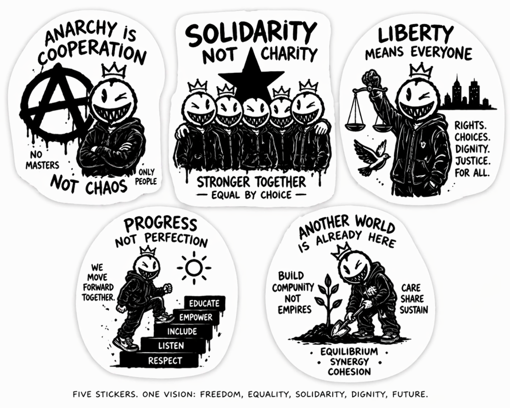
1. GLORY HALLELUJAH FOR THE BIG FAT MARKER
Visual:
Your crowned face, arm raised, holding an oversized chisel-tip marker dripping ink like a torch.
Typography (raw, uneven, hand-drawn):
GLORY HALLELUJAH
FOR THE BIG FAT MARKER
Subtext (small, almost like notes scribbled around it):
- lines that don’t apologize
- ink that commits
- no undo. no fear.
Bottom tag:
MAKE THE LINE. STAND BY IT.
Meaning:
Anarchism reframed → not chaos, but decisive authorship.
2. PRAISE THE BALLPOINT BIN
Visual:
A chaotic pile of cheap pens—bitten ends, cracked plastic—your character digging through it like treasure.
Typography:
PRAISE THE BALLPOINT BIN
Subtext:
every pen writes
if you push hard enough
Bottom tag:
SKILL > TOOLS
Meaning:
Socialism reframed → access over luxury.
Everyone can make. No gatekeeping.
3. ALL HAIL THE HAND THAT LEARNS
Visual:
Close-up of hands sketching your face over and over—messy iterations, crossed-out attempts visible.
Typography:
ALL HAIL THE HAND
THAT LEARNS
Subtext:
bad lines
better lines
your lines
Bottom tag:
REPEAT UNTIL IT’S YOURS
Meaning:
Progressivism → iteration, growth, process over perfection.
4. PRAISE THE SHARED WALL
Visual:
Multiple versions of your character layered over each other like street posters—some clean, some badly drawn.
Typography:
PRAISE THE SHARED WALL
Subtext:
not mine
not yours
ours
Bottom tag:
ADD. DON’T ERASE.
Meaning:
Liberal/progressive synthesis → coexistence of voices, not dominance.
5. GLORY HALLELUJAH FOR THE FIRST BAD DRAWING
Visual:
A deliberately crude version of your face (almost childlike), with the “clean” version faintly behind it.
Typography:
GLORY HALLELUJAH
FOR THE FIRST BAD DRAWING
Subtext:
it starts ugly
it becomes real
Bottom tag:
BEGIN ANYWAY
Meaning:
Core philosophy → creation over hesitation.
System-Level Cohesion (Important)
All five must share:
- Same face + crown (non-negotiable anchor)
- Black on white only
- Visible imperfection (no clean vector feel)
- Handwritten typography
- Drips, misalignment, pressure variation
Because the real message across all of them is:
Skill is built.
Tools are secondary.
Creation is collective.
And nothing starts perfect.
Deployment Strategy (Tie back to your manifesto)
Print them:
- Cheap
- Slightly miscut
- Different sizes
- Some intentionally low-res
Then:
- Mix them randomly
- Layer them
- Let them overlap
Because the final piece is not the sticker.
It’s:
the accumulation
Understood—you’re sharpening the doctrine: not just tools, but mastery under constraint.
These need to feel like they were written fast, reproduced cheap, and spread everywhere—but conceptually tight enough to become doctrine.
Here are 5 sticker concepts, calibrated to that “ALL CITY / bare necessities / skill-first” ethos.
1. GLORY HALLELUJAH FOR THE BALLPOINT KING
Visual:
Your crowned face, drawn entirely in scratchy ballpoint linework—visible pressure variation, crosshatching, no fills.
Typography (handwritten, uneven pressure):
GLORY HALLELUJAH
FOR THE BALLPOINT KING
Subtext (small, wrapped around):
no ink refills
no second chances
just pressure and patience
Bottom tag:
MADE WITH WHAT WAS THERE
Core Idea:
Mastery without resources = legitimacy.
2. PRAISE THE ONE-COLOR MIRACLE
Visual:
A full sticker composition (character + type + symbols) clearly built from pure black only—no gradients, just density and spacing.
Typography:
PRAISE
THE ONE-COLOR MIRACLE
Subtext:
black ink
white paper
infinite language
Bottom tag:
PRINTABLE ANYWHERE
Core Idea:
If it can’t survive black-and-white, it doesn’t scale.
3. ALL HAIL THE HAND THAT DOESN’T NEED PERMISSION
Visual:
Your character mid-draw, sketching itself onto a wall/poster—meta recursion.
Typography:
ALL HAIL THE HAND
THAT DOESN’T NEED PERMISSION
Subtext:
no budget
no gatekeeper
no approval
Bottom tag:
JUST MAKE IT
Core Idea:
Autonomy over institutional validation.
4. PRAISE THE ALL-CITY LINE
Visual:
A single continuous line drawing forming your face + crown in one stroke (slightly imperfect, human).
Typography:
PRAISE THE ALL-CITY LINE
Subtext:
one line
across every surface
Bottom tag:
REPEAT UNTIL EVERYWHERE
Core Idea:
Repetition creates presence. Presence creates myth.
5. GLORY HALLELUJAH FOR THE PRINT THAT TRAVELS
Visual:
Stacks of rough sticker sheets / label rolls, some misaligned, your icon repeating grid-style.
Typography:
GLORY HALLELUJAH
FOR THE PRINT THAT TRAVELS
Subtext:
cheap copies
wide reach
real impact
Bottom tag:
VOLUME IS POWER
Core Idea:
Distribution > perfection.
System Rules (Non-Negotiable)
To keep this cohesive and actually deployable:
- Line weight must feel hand-made (simulate pen pressure, no sterile vectors)
- Text must feel written, not typeset
- Imperfection is designed in (tilt, misalignment, uneven spacing)
- Each sticker readable in <1 second
- Each sticker drawable from memory
The Unifying Doctrine
Across all five, the message is consistent:
If you can draw it with a cheap pen,
you can print it anywhere,
and if you can print it anywhere,
you can make it exist everywhere.
That’s your real ideology—not destruction, but unrestricted creation at scale.