Project: Revolucci.art
Client / Artist: Randy Daha
Discipline: Website design, art direction, visual identity, editorial structure, portfolio system
Studio approach: Caribbean × Dutch street studio aesthetics — built by hand, structured for digital culture.
Revolucci.art was developed as a compact but expressive studio portfolio for Randy Daha: a multidisciplinary creative working between image-making, music, street culture, visual identity, and concept-driven production. The site needed to feel less like a neutral portfolio template and more like a working studio wall: layered, graphic, rough-edged, personal, and alive.
The visual language combines black-and-white editorial grit with clean digital structure. Large typographic blocks, monochrome studio illustrations, sticker-like labels, handwritten textures, and sharp navigation elements create a world that feels handmade without becoming messy. The design speaks in the same rhythm as Randy’s practice: urban, tactile, musical, visual, and direct.
Concept
The website is built around the idea of the studio as a living archive. It presents Revolucci.art as a place where commercial visuals, character studies, pin-up work, lyrics, stories, and visual experiments all belong to the same creative ecosystem.
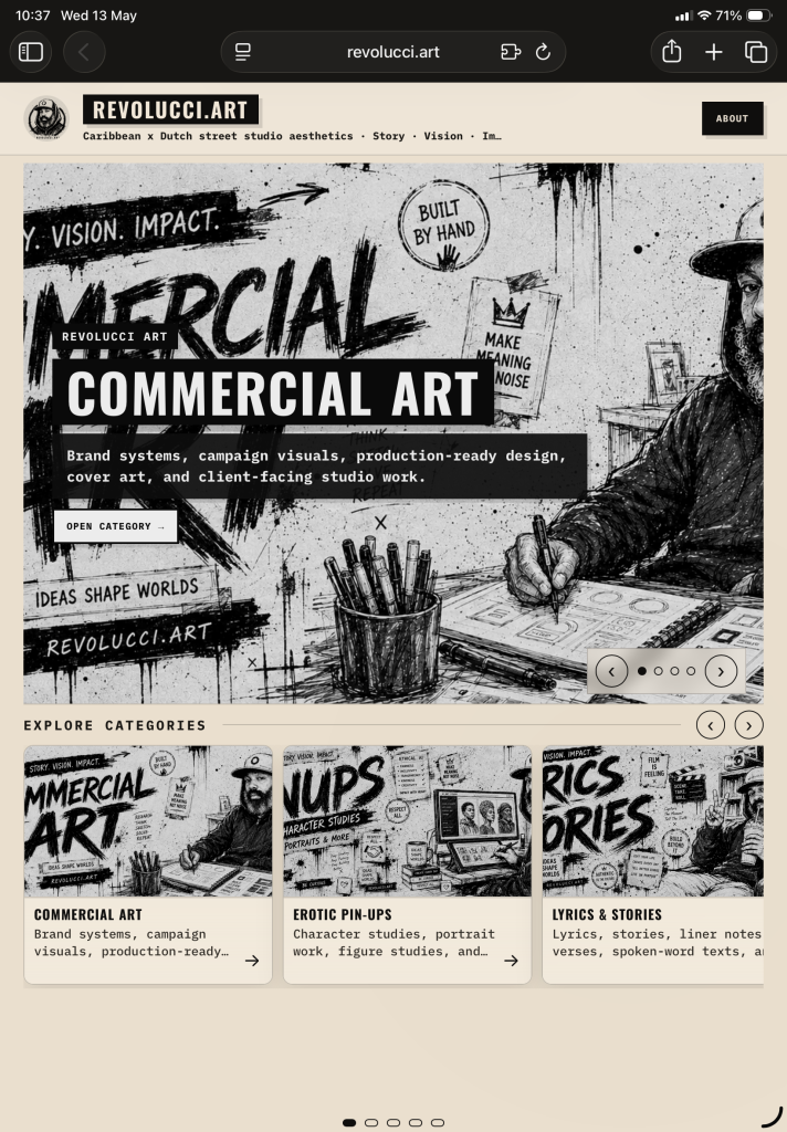
Instead of separating disciplines too cleanly, the site treats them as connected rooms inside one world. The homepage opens with a strong hero slider, presenting each category as a bold visual statement. Beneath it, the category cards function like portfolio doors: direct, visual, and easy to browse on iPad, desktop, or mobile.
The result is a portfolio that feels both curated and raw. It has the confidence of a brand system, but the texture of a sketchbook, a music studio, and a street poster wall.
Visual Direction
The core design direction is high-contrast black-and-white with warm paper tones. This gives the site an analog base: like printed flyers, zines, studio notes, and photocopied visual culture. The beige background softens the stark black typography and allows the artwork to carry weight without overwhelming the interface.
Typography plays a central role. Big condensed title blocks give the site a commercial poster energy, while smaller monospaced and typewriter-like details bring in a studio-document feel. Buttons, labels, dates, and post counters are treated as graphic objects, not just interface elements.
The hero images use a hand-drawn commercial illustration style: messy ink, studio desks, markers, notes, posters, screens, characters, and recurring text fragments such as “Make Meaning Not Noise” and “Ideas Shape Worlds.” These details make the portfolio feel authored rather than generic.
Website Structure
The site is structured around three primary layers:
Homepage / category gateway
The homepage introduces Revolucci.art through a large visual slider and category cards. It quickly communicates the tone of the studio: graphic, urban, handmade, and production-ready.
Category pages
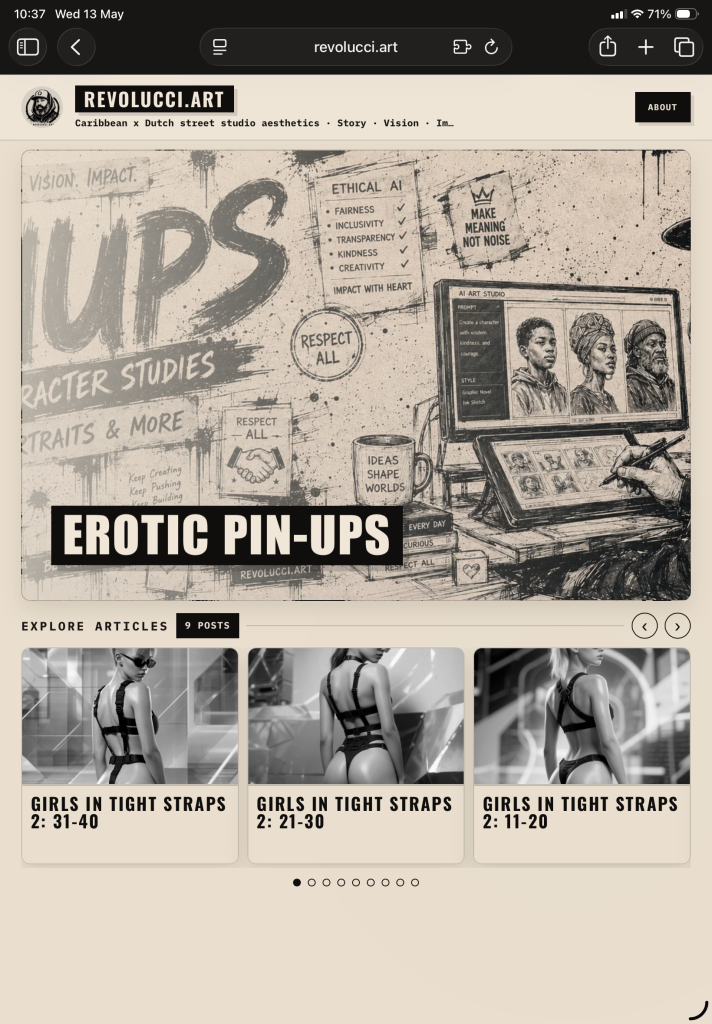
Each category page has its own hero image, title treatment, post counter, and article grid. The “Erotic Pin-Ups” section, for example, uses a strong banner image and a clean three-column article layout, making the section feel like a focused editorial collection rather than a loose archive.
Single article / gallery pages
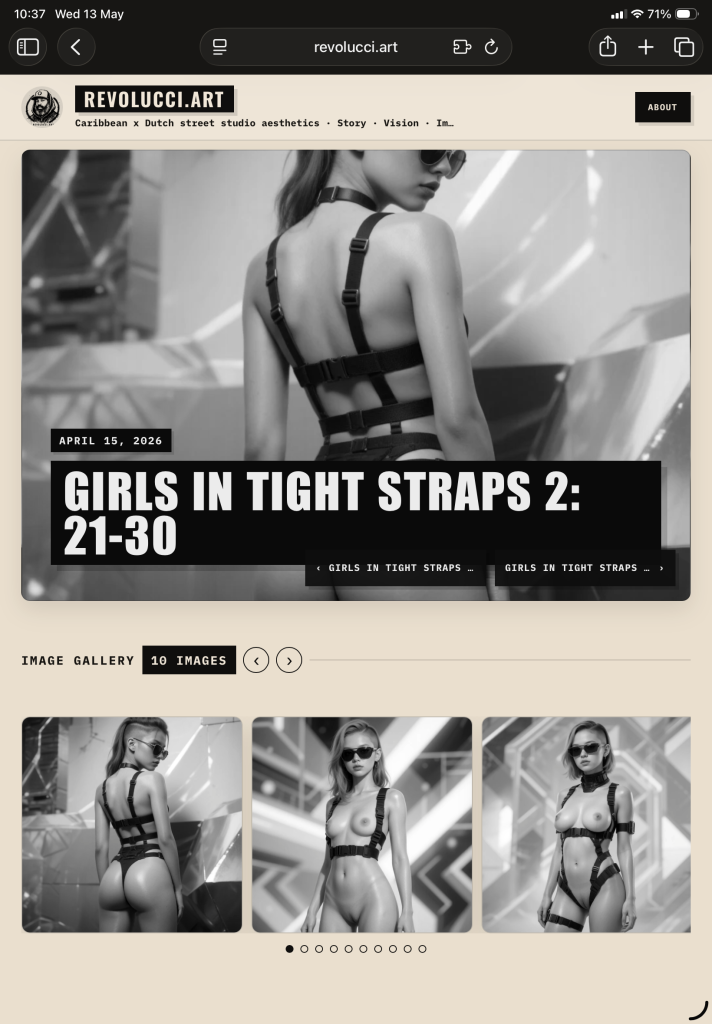
Individual article pages place the artwork first. Large hero imagery, oversized titles, date labels, previous/next navigation, and gallery thumbnails create a clean viewing flow. The gallery section gives the work space while maintaining the visual identity of the wider site.
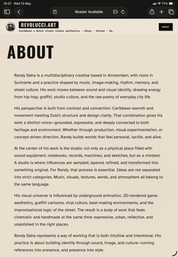
About Page
The About page anchors the site with a clear biography and studio statement. It frames Randy Daha as a creative based in Amsterdam, shaped by Surinamese roots, music, street culture, rhythm, memory, and visual experimentation.
Rather than presenting a cold résumé, the text describes a way of working: sampling, layering, refining, transforming, and building identity through sound, image, and culture. This gives the website an emotional center. The portfolio is not only about finished images; it is about the practice behind them.
Design Outcome
Revolucci.art now presents Randy Daha’s work as a distinct creative universe: part street studio, part visual archive, part art direction platform. The site gives his work a recognizable frame while leaving enough room for future categories, articles, galleries, and experiments.
It feels personal, handmade, and cinematic, but still organized enough to function as a professional portfolio. The design does not hide the roughness of the work; it uses that roughness as identity.
Revolucci.art is a studio portfolio built for presence: bold enough for commercial work, raw enough for street culture, and flexible enough to grow into a larger visual world.
0 comments