


NOT YOU AGAIN
Future Franchise Bible
Brand System + WordPress Visual Template
1) Brand Vision
Not You Again is a global visual language for the underground: rebellious, icon-driven, black-and-white, and built to scale across fashion, music, editorial, film, events, and digital products.
The brand exists as a franchise ecosystem, not a single logo. Its power comes from a repeatable system of symbols, characters, typography, and attitude that can expand without losing identity.
Brand Promise
Make work that feels raw, immediate, and culturally sharp — with enough system discipline to grow into a global studio.
Core Positioning
- Studio / Creative label
- Visual culture brand
- Activist design language
- Streetwear-ready identity system
- Digital-first franchise framework
2) Brand DNA
Three Pillars
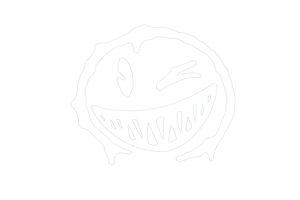
- The Stones — the white stone and black stone as the central symbolic pair.
- The Smiley — the signature face, wide and aggressive, used as the emotional core.
- The Characters — two archetypes that embody the stones:
- White Stone Character: punk / metal / bunker / DIY
- Black Stone Character: hip-hop / reggaeton / dancehall / confident street luxury
Brand Meaning
- White Stone = exposed, raw, open, chaotic, handcrafted
- Black Stone = heavy, controlled, dark, confident, composed
- Overlapping pair = friction, dialogue, dual identity, movement
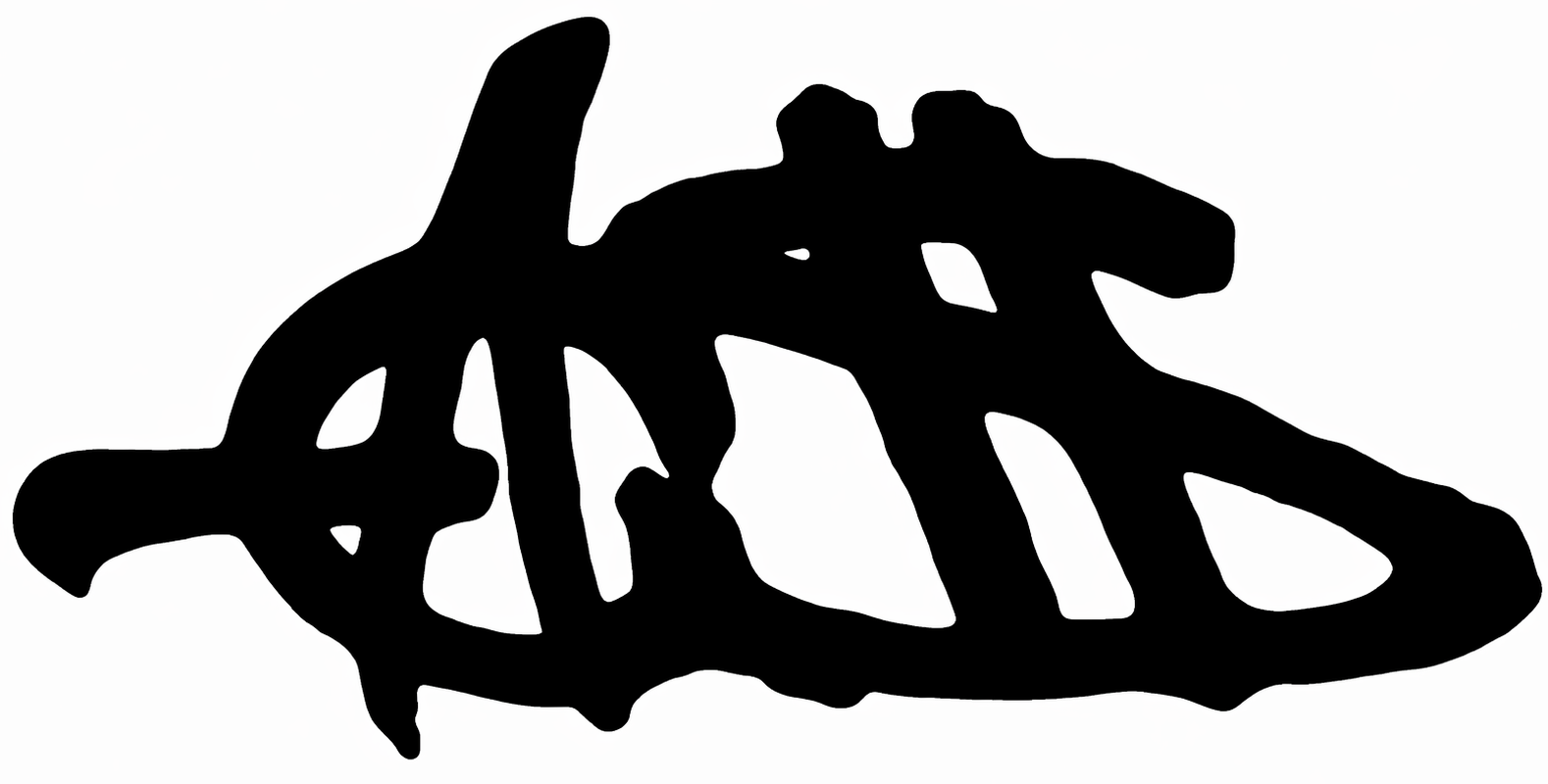
3) Logo Architecture
Primary Mark
The AS logo is the main corporate and cultural signature. It should feel like a hybrid of:
- handwritten energy
- condensed bold typography
- graffiti tension
- symbolic overlap between the stones
Logo Rules
- Always designed in black and white only
- Always works on transparent background
- Prefer sticker-like edge treatment or outlined silhouette
- Avoid soft gradients, realism, or decorative excess
- Use the logo as a symbol, not just letters
Logo Variants
- Primary AS mark
- AS mark with stone overlay
- AS monogram lockup with wordmark
- Full studio name lockup
- Compact icon version for social avatars, favicons, and app icons
4) Visual Language
Shape Language
- Jagged strokes
- Drip edges
- Heavy fills
- Rough brush cuts
- Thick condensed verticals
- Hand-drawn asymmetry
Graphic Behaviors
- Overlap
- Stack
- Crop aggressively
- Use strong negative space
- Build compositions like posters, stickers, zines, and bootleg flyers
Sticker Logic
Every graphic should feel like it could be:
- cut out
- pasted on a wall
- printed on a tee
- used as a stamp
- scaled into an icon
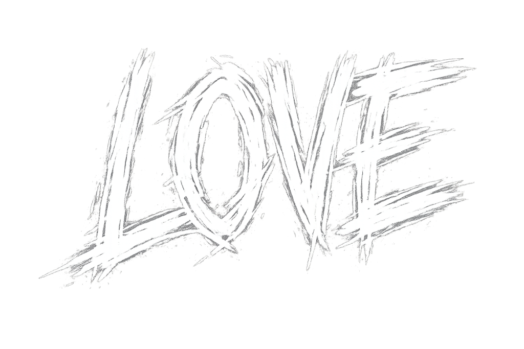
5) Typography System
The typography must combine handwritten energy with condensed bold authority.
Type Roles
Display / Header
- Tall, bold, condensed, loud
- Used for page titles, landing sections, campaign names, product drops
Accent / Handwritten
- Rough, brushy, expressive
- Used for callouts, signatures, annotations, campaign tags
Body / Utility
- Clean condensed sans or simple grotesk
- Used for navigation, descriptions, footer text, product detail, and editorial copy
Typographic Tone
- Loud headlines
- Minimal but sharp body copy
- High contrast between voice layers
- Never over-polished
6) Color System
Core Palette
- Black
- White
Optional Expansion Rules
If future collections need extension, keep the system monochrome first and allow only controlled accent color in campaign-specific activations.
Non-Negotiables
- No rainbow palettes as default
- No soft pastel identity
- No glossy color treatment that weakens the raw system
7) Character System
Character A: White Stone / Metal / Skater
Visual traits:
- aggressive silhouette
- layered clothing
- boots, chains, patches, oversized outerwear
- punk / bunker / DIY / underground energy
Character B: Black Stone / Hip-Hop / Reggaeton / Dancehall
Visual traits:
- confident posture
- baggier street tailoring
- hoodies, caps, jewelry, strong stance
- controlled swagger, global street culture energy
Character Usage
These characters should appear in:
- campaign art
- launch posters
- animated shorts
- merchandise graphics
- social story templates
- lookbook vignettes
8) Icon & Values System
The icon system is a modular language for the studio.
Core Values Icons
- anti-system
- truth / eye
- DIY / tool
- no compromise / skull
- self-made / crown
- environment / responsibility
Use Cases
- brand manifesto pages
- packaging stickers
- icon rows on website
- chapter dividers in editorial layouts
- merch badges and woven labels
9) Brand Voice
Voice Traits
- direct
- rebellious
- smart
- streetwise
- self-aware
- uncompromising
Tone Examples
- short statements
- sharp slogans
- manifesto-style lines
- no corporate softness
- no fake hype
Voice Rule
The brand speaks like a studio with a point of view, not a brand trying to fit in.
10) Global Franchise Vision
Studio Structure
Not You Again should operate as a scalable creative enterprise with multiple outputs:
- brand identity
- fashion graphics
- music visuals
- editorial systems
- live event art
- digital product design
- licensing / collaboration assets
- campaign direction
Expansion Model
The visual system must work across:
- local drops
- international launches
- collaborations
- franchise chapters
- seasonal campaigns
- language adaptations
Geographic Flexibility
The brand should feel native in:
- New York
- London
- Tokyo
- Seoul
- São Paulo
- Paris
- Mexico City
- Johannesburg
- Berlin
The system stays culturally flexible while keeping the same visual grammar.
11) WordPress Template Direction
Website Purpose
The website should feel like a digital zine / studio archive / brand HQ / storefront in one.
Recommended Structure
Home
- hero AS mark
- brand statement
- featured drop or current project
- stones/characters preview
- manifesto snippet
- latest news / releases
About / Manifesto
- brand story
- philosophy
- values icons
- visual rules
Work / Projects
- grid-based archive
- case studies
- campaign visuals
- collaboration pages
Shop / Drops
- product cards
- sticker-like merch presentation
- bold product names
- minimal descriptions
Studio / Contact
- inquiry form
- social links
- location / time zone / availability
Archive
- older campaigns
- posters
- visuals
- language experiments
Layout Rules
- full-width hero sections
- strong grids
- asymmetrical blocks when needed
- sticker/card presentation for assets
- black-and-white first
- large typography
- generous spacing with hard edges
12) WordPress Theme Styling System
Design Tokens
Background: white / black
Text: black / white
Borders: thick, high-contrast, often rough-edged
Buttons: rectangular or sticker-shaped
Cards: white panels with bold outlines or black panels with reversed type
UI Components
- sticky top nav
- bold logo lockup in header
- hover states with rough underline or inversion
- image tiles with black frames
- tag pills for categories
- manifesto blocks
- icon rows
- footer as strong black band
Button Style
- uppercase
- condensed type
- heavy weight
- high contrast
- minimal rounding
- no glossy effects
Image Style
- monochrome treatment
- poster framing
- cutout look
- grain or rough texture optional, but controlled
13) WordPress Page Template System
Template 1: Home Hero
- oversized AS logo
- one-line manifesto
- featured project
- 3-icon value strip
- CTA button row
Template 2: Editorial / Manifesto
- large chapter headings
- side notes
- icon dividers
- pull quotes
- strong rhythm
Template 3: Project / Case Study
- title block
- intro summary
- image gallery
- outcomes / notes
- related projects
Template 4: Product / Drop
- product image
- title
- edition or drop label
- details
- buy action
Template 5: Character Profile
- character portrait
- role in brand world
- visual traits
- associated stone
- associated icon set
14) Motion & Interaction
- subtle but confident animation
- sticker pop-in
- slide, snap, reveal, glitch, or cut transitions
- no soft fades everywhere
- hover interactions should feel tactile and editorial
15) Photography / Art Direction
Preferred Look
- high contrast
- black and white
- strong silhouettes
- urban, DIY, poster-like
- posed with attitude
- raw studio lighting or direct flash
Avoid
- polished lifestyle stock imagery
- weak color grading
- over-smoothed commercial looks
16) Franchise Expansion Rules
Every new product, page, campaign, or character must answer:
- Does it feel like Not You Again?
- Does it respect the stone duality?
- Does it work in black and white?
- Can it become a sticker, a stamp, or a logo?
- Does it preserve the underground tone?
17) Starter Content for the Website
Hero Line Options
- NOT YOU AGAIN.
- WE BUILD THE NOISE.
- THE UNDERRATED BECOME THE STANDARD.
- RAW BY DESIGN.
- STUDIO / CULTURE / SYSTEM.
Manifesto Snippet
We design symbols for people who move differently. We build a world where contradiction becomes style, and style becomes identity.
18) Next Build Deliverables
- AS logo family
- overlapping stone smiley system
- character sheets for white stone and black stone
- icon set for values
- WordPress homepage wireframe
- black-and-white UI kit
- sticker pack system
- type rules and lockups
WordPress Styling Blueprint
Global Settings
- Use a monochrome base theme
- Default to white background with black typography
- Provide black inversion for key sections
- Keep the site fast, bold, and editorial
Header
- Left: AS logo
- Center/right: Home, Manifesto, Work, Shop, Studio
- Sticky behavior on scroll
- Active nav underline in rough brush style
Footer
- full-width black block
- white condensed text
- social links
- contact info
- small signature mark
Homepage Module Order
- Hero
- Brand statement
- Featured stone system
- Character preview
- Latest drop / project
- Values icons
- CTA / contact
Mobile Behavior
- Keep typography large
- Stack content vertically
- Preserve sticker-like spacing
- Keep icons and logos readable at small scale
- Avoid cramped layouts
Final Direction
Not You Again should feel like a brand that already exists as a movement, even before the product line fully launches. The visual system should be repeatable, iconic, and hard enough to survive global expansion without losing its underground edge.
0 comments